Thumbnail sketching:
a designer's best tool
A “thumbnail sketch” is just a very small, very loose, very fast drawing made at the start of the design process, which helps the designer begin to visualize the final product. These sketches are used all the time by architects, engineers, industrial designers, and many other creative people in their work, as they help get concepts on paper quickly and with only a minor investment in time. And, because they are so quick, they are also disposable; Try to do 20 or 30 of them when you start on a design project, until your happy with the direction your seeing the work going.
Let’s say you'll be designing a set for Who’s Afraid of Virginia Woolf. You've already read the script, done some research, met with the director, and you agreed to bring the set close to the audience.
BEGIN: Sketch your preliminary ideas on scratch paper. You can sketch your ideas with whatever tool you like. (pencil, pen, marker, crayon, chalk, charcoal...etc)
HERE ARE SOME THUMBNAIL SKETCHES
The first "Frontal" sketch just shows the proscenium arch, the thrust, and a couple of figures to provide some scale. Notice how loose it is. The sketch is just over two inches across.

The second sketch shows everyone’s first conception for a box set: a perspective box on the stage, with the front door up center. Booo-ring.

Sketch #3 changes the angle of the walls. A little more interesting. Now we're starting to get somewhere, and the sketch is still just over two inches across.
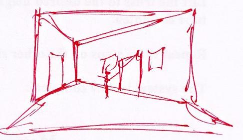
For the next sketch, the set is moved downstage so it comes forward of the proscenium opening, onto the thrust. Good, but it’s too much.

In sketch five, we've playing with the shape of that back wall.

Sketch #6 takes that shape from #5 and turns it into an entryway, up a step from the main floor. At this point we need to get thinking about the furniture. Time for a floor plan.

Next is a floor plan (arial or blueprint format), still a couple of inches across. Everything needs enough room for actor traffic.

Sketch 8 pushes the furniture upstage .

Nine is a mess: adjusting the angles of the walls relative to a large rug just introduced. The nice thing about these sketches is that they’re for the designer so they don’t have to be pretty. They’re just a way to think on paper.
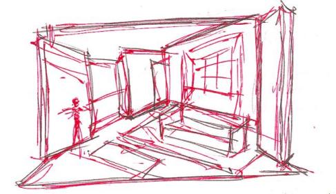
Ten is getting somewhere. Now we've added an alcove SR for George’s desk and a window alcove SL for additional seating (this is where we would do a little more research into residential interiors of that time and place).
These give us more usable space and make the walls more interesting. Also, we're showing two smaller rugs instead of one large one.

Next, Sketch 11 shows what the primary shapes are.
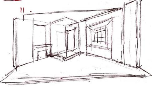
And finally, Sketch 12 is a slightly cleaned-up version of 11, focusing on the geometric shapes of the walls and the overall architecture. It’s still very quick and loose, but it tells us a lot. Now we can begin to develop this as a real floor plan, add another entrance or two, and we have something to show the director as a first-pass concept.
Do lots of these, at the level of detail shown in the first three or four. Thirty or forty aren’t unusual, they only take a short time, and you can do them in an easy chair with a mug of coffee. Do a few, go away for a while, and then come back and look at them with a fresh eye. That’s when you can start asking, is this concept serving the story? Then can go from there.
Thumbnail sketches are a great way to begin the design process, as you can explore several different approaches in a short time. As you continue doing them, you’ll find they become easier and faster, and you’ll be pleased with the results.
___________________________________________________________
This was edited and adapted from a set designer's blog page. This content is being used solely for education purposes and was edited to work in the high school technical theater classroom as a part of a lecture.
View the original blog content at:
No comments:
Post a Comment